Twenty-One Human Capital Management

Fractional HR Consulting
Location
Pennsylvania
Date
2021
Category
Brand Identity, Logo Design, Visual Systems
Industry
Fractional HR Consulting

Twenty-One HCM

Brand Identity, Logo Design, Visual Systems

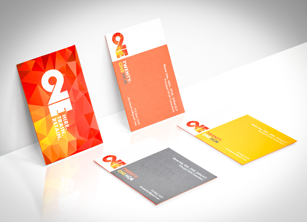
Twenty-One Human Capital Management (HCM) offers fractional HR services focused on hiring, training, and retaining top talent. The company was founded on the belief that growing companies shouldn’t have to sacrifice quality HR strategy just because they’re not ready for a full-time team. GRID Creative developed a bold, high-energy brand identity that captured the firm’s forward-thinking approach and made an immediate visual impact in a traditionally conservative industry.

Challenge

To create a brand that was:
• Professional, but not boring
• Modern and energetic without losing credibility
• Flexible across print and digital uses
• Strong enough to carry a short company lifespan or pivot if the business evolved
• Designed for a solo founder with extensive HR experience but limited time to execute marketing

Approach

I built the identity around the phrase “Hire. Train. Retain.”—the three pillars of the company’s approach. The name “Twenty-One” carried both strategic and personal significance for the client. Beyond representing a 21st-century approach to HR, the number held special meaning and added emotional weight to the brand story.
The logo features a bold “21” mark with the service pillars built directly into the design. To bring in warmth and energy, I used a faceted geometric background in a palette of red, orange, and gold gradients. The typography is clean and structured, helping the brand feel trustworthy and focused.

Deliverables

• Logo and brand identity system
• Full-color and reversed brand marks
• Multi-version business card suite
• Brand messaging and tagline integration
• Print-ready files for cards and presentation templates

Design Notes

The visual system needed to feel sharp and modern but still timeless enough for professional settings. The angled geometric background provides a dynamic foundation, while the “21” mark doubles as a logo and a conversation starter. By embedding the tagline directly into the graphic, I made sure that even quick-glance interactions conveyed the business’s purpose.

Result

The final identity gave Twenty-One HCM a confident and memorable launch presence. It helped the founder convey professionalism and polish in first impressions—especially important when selling high-trust, high-touch services like HR consulting.

01. Logo Design

02. Color Palette

Ignite Red

#F12900

Drive Orange

#F15A24

Brightwork Gold

#F7931E

Anchor Gray

#F7F7F7

Clean Slate

#012C4C

A bold, energetic red that signals action and momentum.

A confident, vibrant orange evoking determination and forward motion.

A golden yellow that suggests clarity, optimism, and polished results.

A steady, grounding gray that balances the intensity of the warm tones.

A crisp white-gray background tone for whitespace and clean presentation.

03. Typography

FUTURA

Aa

ABCDEFGHIJKLMNOPQRSTUVWXYZ

abcdefghijklmnopqrstuvwxyz

123456789!@#$%^&*()-+=

04. Mockup

Other Projects